All CategoriesGeneral GTGGeneral Discussion › Start/End Turn Formatting in next Edition

Start/End Turn Formatting in next Edition

83 posts · 6710 views · started 2013-08-07 02:25 UTC
PU
Pushingthelimits
2013-08-07 02:25 UTC
#1

There has been much discussion about how much text there is on the cards. There have been some ideas floated out there to have text like start of turn and end of turn highlighted in colors or have icons before them. I think one user has even done this for some cards available for print.

With the printing of Vengeance being a stand-alone entry into the game system, is >G considering improving on the cards? 

This game is so good, I just get tired of being taken out of the story of the game as I check every single part of all cards (all in caps text which is no help).

Please don't respond if you are just a fan who is going to say that I should just accept it this way. I am a fan with a question to the company and I see many posts from people who discuss that the gameplay would be improved by changing the text area with highlights or icons.

RO
Ronway
2013-08-07 02:31 UTC
#2

Just going to say, this is a Mega-expansion, not a Stand-alone.

SP
Spiff
2013-08-07 03:36 UTC
#3

It's been brought up, often by me, often asking for icons to represent the start- and end-of-turn actions on a card so you can avoid having to read "at the start of the environment turn" over and over on all the cards (think of how much space it would save, if nothing else).  Then the conversation turns to a general discussion of icons on cards, a bunch of people say they like reading a novella's worth of text on the cards each time they scan the table for some reason, and it goes nowhere.  The usual ending is for someone from >G to point out that they considered using more icons when they designed the game, but they didn't want people to have to consult a rulebook during play, so we got the overwordiness. 

I still think the game would be vastly improved by the use of icons in the incredibly ubiquitous situation where you have a start- or end-of-turn effect.  Not enough people agree (in public) with me though to build an actual movement around it, though.

TS
Theta_Sigma
2013-08-07 05:17 UTC
#4

I see the potential for icons and the like, but I worry that it would clutter up the cards, especially on the villain cards. Definitely good for the oversized cards though.

SP
Spiff
2013-08-07 05:30 UTC
#5

(see what I mean?)

How could using an icon to replace 7 words (at, the, start, of, the, environment, turn) result in more clutter, not less?

TS
Theta_Sigma
2013-08-07 06:30 UTC
#6

Because an icon would have to be large enough to be distinctive and still have the information for what has to be done. Also, I was actually agreeing with the idea of the icons, but I questioned the logistics of them, rather than saying "I like to read all the information".


Incidentally, I don't read the whole 7 words. Though the whole sentence is there, all I need to see when scanning over that part is "start, environment".

FO
Foote
2013-08-07 12:02 UTC
#7

The one issue I can think of now is consistency. Being this far into the games life cycle and with only 2 more expansions after vengeance, making such a large format change might not be in the games best interest. They would have to reprint everything yet again and I don't know how many copies of the base set I can handle. 

PU
Pushingthelimits
2013-08-07 12:02 UTC
#8

I like what Theta Stigma said about scanning the text. The idea of highlighting the text would just make it easier to scan without getting into the icon argument.

For instance, every "start" is green, every "end" is red.

Then blue for environment, brown for villain, pink for hero (or better graphic designers pick colors). I think Spiff already did this but I don't have the link. I don't think >G should refrain from improving their product like this.

TS
Theta_Sigma
2013-08-07 12:06 UTC
#9

Since at least two people I play Sentinels with regularly are colour-blind, I wouldn't suggest red & green, but I do like the idea of highlighting the text.

PQ
PePe_QuiCoSE
2013-08-07 13:01 UTC
#10

I highly doubt anyone would complain that the new cards receive a 'design' improvement and expect backwards compatibility in future printings (well, there's always someone who complains about something, but that's just because it's impossible to please everyone).

Just having the words START and END highlited (I would add WHENEVER, freaking whenever...), iconized like the (H) (which come on, it doesn't take more space and it's most often on Villain cards) or anyting that let's you know at a glance if you have to take a card into considerations or not without memorizing the card. Really, just have them in CAPS should be enough.

The strong point of the game is the story the gameplay tells and having to stop, re-read, resolve, start again, etc. detracts you from that.

SI
Silverleaf
2013-08-07 14:57 UTC
#11

I love what Spiff's done with his oversized villain cards (which reminds me, I still haven't got round to printing them and I must rectify that ASAP) with the SV and EV icons. Very easy to follow, you only have to look it up once if you don't grok what it means straight away and you'll never have to look it up again. What else could SV possibly mean in that context?

The big advantage of it is in ease of scanning the card during play. I'm always missing effects unless I use my homemade Start and End tokens, and even then I have to read a good chunk of the card every time because there's nothing to "point" me at the relevant section of text. This is especially problematic in the cards that say essentially, "At the end of the whatever turn, do X. At the start of the whatever turn, do Y." because I expect the start stuff to come before the end! (I know, 9 times out of 10 you'll apply the end-of-turn stuff first since the card's played during the play phase, but it's still unintuitive for me.) A quick glimpse at the table doesn't tell you how many things will go off at the start of the villain turn either - you have to read every card unless you have them memorised (I most certainly don't).

Icons have the advantage that if they're well designed, colourblindness isn't an issue. If you use a mixture of colour, shape, pattern, etc, you can accommodate everyone. As an example, something similar to Spiff's icons:

  • Icons are basically two letters in a box.
  • S for Start, E for End. Maybe something different for special "out of the usual order" effects if necessary, just to add an extra visual anchor.
  • V for Villain, H for Hero, E for Environment.
  • Therefore, we get SV (start of villain turn), EE (end of environment turn), etc.
  • Start is green, End is red - this works with our "red=stop/green=go" prior knowledge. Using white for the background of one and black for the other makes them even clearer and very colourblind-accessible.
  • Different shaped boxes for Villain, Hero and Environment - maybe square for villain, round for hero (to co-ordinate with the H icon we have already) and hexagon for environment (since hexes are associated with terrain), to add another layer of recognition.


The disadvantage of highlighting the text is that it's much fiddlier to do this in a way that's both intuitive to people who associate green and red with start and end (which is probably most of us) yet is still accessible to people with red-green colourblindness.

But the big problem is of course, as Foote says, we're probably way too far into the series now for it to be sensible to redesign and reprint the cards. I can't justify essentially buying everything again either in terms of cash or environmental impact. I'm very sad that this wasn't considered right from the start - I'm sure it would have made playing easier for a lot of people.

Edited to correct red/green confusion on my part: that would never have happened if I'd used the actual colours instead of just the words!

SP
Spiff
2013-08-07 16:37 UTC
#12

I think Silverleaf meant "Start is green, End is red", since she's the one who talked me into making that change on my cards.  But she's right on all those points.

I think we're far enough along in the game's evolution that a refresh of this kind is absolutely warranted.  Imagine if the designers had used the text "the number of heroes in the game" instead of the simple, easy to understand "H" icon.  That's essentially what's happening here.

JA
jagarciao
2013-08-07 16:50 UTC
#13

I support iconizing the "Start/End of your/villain turn" actions, even if it is done just for the last expansions and all printings only (I wouldn't re-buy everything, but it would make the game better for the next generation). 

I understand that this would cause a certain lack of consistency between the cards, but come on... it's not like there aren't ten thousand threads already pointing out other inconsistencies in wording and stuff... at least this inconsistency will have not change the way a card is played. 

I currently highlight the "Start" and "End" of turn actions with green and red sharpies, respectively, and it has made a HUGE difference in gameplay. 

RE
Reckless
2013-08-07 18:29 UTC
#14

One of my players is red/green colorblind, so I'm with you there.  We use dice to track HP, so I try pretty hard to avoid using ones that he has trouble reading.


On the subject at hand, I have nothing against using icons and if there was an icon designed that was simple and straightforward that didn't require a lot of study to understand, I'd be all for it.  That being said, I don't typically find reading the cards all that tortuous, since I've learned most of the texts and can recite a number of them from memory.  If this is a problem that other people feel needs to be addressed, I could see an icon being a positive thing.

However, I'm quite surprised at how passionate people are on both sides of this argument.  I felt that the Sot/EoT promo tokens did wonders for zipping along the card and finding the right information.  That's not to say that I'm against a symbol, but the amount of text on the cards has never been something that made me want to pull my hair out.

SI
Silverleaf
2013-08-07 18:35 UTC
#15

Thanks, that's exactly what I meant. But my brain is often an idiot and gets confused very easily (I have a medical condition which affects my cognitive ability at times). All the more reason for icons, right? :wink:

SI
Silverleaf
2013-08-07 18:49 UTC
#16

Yeah, for people who have everything memorised it won't make any difference, because you're not reading the cards anymore. You've compartmentalised the information in your head and no longer need the visuals. Icons would make a whole lot of difference to those of us who can't or won't memorise though.

I would't want to play a physical game without my tokens - they do help a lot in cueing me that I need to check out what the effect is at the appropriate part of the turn . But on the other hand, they don't really address one of my main problems which is that the bit of text i'm looking for blends into the rest of the text and I have to spend extra time and effort finding it.

The way I'm seeing it, we have people on one side saying, "This could be improved to make games go faster/easier for at least some people," and others saying, "Well I don't have any problems, so keep things as they are". I don't understand that second group at all.

RE
Reckless
2013-08-07 19:40 UTC
#17

That argument from the second group you're describing does seem a little solipsistic.

I can definitely understand people saying it doesn't really seem necessary to get a SoT/EoT symbol on the cards, but I can see how it would make things more convenient.  I personally don't have a strong opinion either way.  If they change it then I'll be interested in finding out what they'll use, and if they don't then my group will just continue to read out the whole card when we check for timing or special circumstances.

PQ
PePe_QuiCoSE
2013-08-07 20:17 UTC
#18

let's start rehashing our arguments over and over!

- Is it fun to read the same card each turn to see if X condition applies?

Not to me!

- Does reducing the time you need to check if X condition applies increase your time-to-fun ratio in the game?

Yes to me!

- Does making an easily visually identifiably reminder of when to check X condition reduces the time to check when X condition applies?

Yes to me! Two in a row!

- Is it possible to create such reminder without cluttering the cards? Or with adding to much iconography?

The (H) icon would imply that it is in fact possible. There are 3 important keywords (IMO) to take into consideration: Start, End and Whenever. These are 3 times as many icons as before, but are also intuitive ones that fit in the back of the reminder rulebooks. The issue I can see with this though is the question of why was this not taken into account when the (H) was introduced. The threshold of icons to be introduced (I saw mention of Villain, Environment...) is really subjective, but I'd say above 7 is too much.


So, besides the argument "not needed / don't care", (where the most criticism the game receives is around the amount of booking is needed) and "why this wasn't being done before" which is unavoidable in any new/future printing of the game (since then the argument is "why didn't the fix this already"), what are the downsides of taking this approach? I'm really interested in actual arguments against this rather than "if you are going to do it, do it right".


PS: I don't have the promo tokens but will try different things on how to make easy reminders for different conditions/triggers. I often forget the Nemesis bonus. I do have some spare tokens from the Tomb Raider CCG that could help. Will try doing the highlighting thing too on one Villain (probably will try it out with Spite,since I don't care much for him anymore and he has a lot of situations to check).

JA
jagarciao
2013-08-07 20:25 UTC
#19

Having played a bit of Magic: The Gathering in my younger days, I definitely had a really hard time bringing myself to put a sharpie to the cards (had to use a sharpie because highlighters were way too light to stand out). However, once I did the first set it was a very liberating experience... until in my zeal and excitement I noticed I had marked up Promo Bomber Blade's character card, which I had not originally intended to do.  Oh well...

KA
Karrde
2013-08-07 20:41 UTC
#20

I'm going to start off with the assumption that reprinting/rebuying all the released stuff is not an option. I'm still trying to get my act together and get the EE over year after getting and playing the first edition non stop.

Assuming that, I am against redesigning the cards in future expansions (in this case, add icons/highlights for start and end). I'm big on consistency, but that's a personality trait of mine and realize not everyone shares that.


However, a problem I see that I don't know if brought up yet:

Since this game is modular, you will constantly be mixing old with new. I personally don't want the same rules acting different ways in a game. Once people start to just look for pertinent icons with a quick glance of the table, they are going to forget they still have to fully read the old cards to know/remember any start/end actions needed. I can see this leading to more missed start/end actions than currently.


Anyone know how many total cards have this "problem"? If not overwhelming, perhaps a solution (if >G deems necessary) would be to release an update pack with just those cards to have icons or highlights. For purchase of course, I wouldn't expect it to be free.

RE
Reckless
2013-08-07 21:04 UTC
#21

But wasn't your argument just "This aspect of the game is not fun to me so this is why we should change it"?

I'm not disagreeing with you about icons being a plausable future for this game, but you seem to be more upset by the fact that the opposing sides are using subjective arguments rather than the use of subjective arguments as a whole.  I don't really understand what you mean by an "actual argument" when you're saying "This is what I care about so this is what >G should do and the arguments presented against mine aren't real arguments."

SP
Spiff
2013-08-07 21:43 UTC
#22

Since this game is modular, you will constantly be mixing old with new. I personally don't want the same rules acting different ways in a game. Once people start to just look for pertinent icons with a quick glance of the table, they are going to forget they still have to fully read the old cards to know/remember any start/end actions needed. I can see this leading to more missed start/end actions than currently.

So, don't improve some cards because there will still be unimproved cards in the game?  A tough argument to make.  It's true that if half the cards on the table have easily-to-see icons and half don't, the cards without icons will be more likely to be overlooked.  But that's an argument for fixing all the cards, not for not fixing any cards.

PQ
PePe_QuiCoSE
2013-08-07 21:44 UTC
#23

uhm... what? My arguments were presented tongue in cheek because it really is repeating what was said elsewhere. And I really have to ask, there are people that enjoy more checking conditions of a game system rathen than giving in to the story of kicking a Villain's butt? I'm not considering other people arguments subjective, more like excuses to keep status quo as a validation on what has been the current... erm... procedure for the gameply. Yeah, I went there.


This is a bit besides the point but I'm not arguing what the GTG guys should do. IMO they should do whatever is best for their business and should gauge if a change to an already published game/expansion is an actual benefit for the game's value/perception/evolution and if that benefit is worth the chance of estranging previous buyers. What I'm talking about is how would the game's enjoyment could be increased, focusing on what is popularly considered fun and what is considered stuff that need to happen to get to the fun. That might or might not be contrary to GTG interests.


Karrde: I'm pretty sure there are too many to make subsets of cards. Basically anything that is not a One-Shot has this type of text. About modularity: you should always be reading a card the first time (when it shows up) so when you do you should be able to see if it has icons or pure text. Mixing old cards without icons and new ones with icons shouldn't be a problem. Similar to who it isn't an issue mixing Rook City with 1st Core edition. About the 'need' to rebuy stuff: this is really personal so little point arguing that. What is interesting is, would you stop buying GTG stuff if each new printing 'fixes' old complains to make a 'better' product?


SI
Silverleaf
2013-08-07 21:49 UTC
#24

That's a good point. Personally, while I fully support the idea of using icons or similar to mark out the important bits of text, I haven't decided whether I'd prefer the future expansions of the game to actually use them, for exactly the reasons you mentioned. I guess I'm mostly arguing "this should have happened from the start", tbh.

So either we'd end up with mixed sets (some with icons and some without) which would lead to missing things on the old cards, or we keep a system that at least some of us think is suboptimal, or everything gets reprinted with icons which is potentially expensive and wasteful. None of these seem like good options.

So, those of you who had the first edition and then got Rook City, how did you deal with the changes to the original cards with the introduction of the H mechanism and so on? I guess it's relevant here.

JA
jagarciao
2013-08-07 21:50 UTC
#25

I think what he meant is that the arguments against aren't really demonstrating a downside to the proposed addition of SoE/EoE icons, but rather they are arguing that such addition isn't necessary because the problem isn't there, or isn't a big deal... but they are adamant about not making the change even though it won't really have a negative effect to their game. 

Karrde does bring up the point that having mismatched card formats may cause bigger confusion and/or frustration to some players. I, personally, wouldn't have a problem with that and don't believe it would cause more missed actions for me (since I mark my cards is), but I can see that being an issue for people (a couple of people I game with come to mind). 

Perhaps the only solution really is to finish the releases as they are and then make the change for future printings (a sort of 3rd Edition... where hopefully other issues get worked out as well) so new players can benefit and old players can decide whether the switch is worth the hassle and expense or not. 

RE
Reckless
2013-08-07 21:52 UTC
#26

It's not about enjoyment.  I don't think anyone is saying that symbols or lack thereof is "more fun" on either side.  It just seemed like you were saying that other arguments were subjective and yours wasn't.  If I misread your post, I apologize.  I just didn't quite understand what your point was.

SP
Spiff
2013-08-07 22:08 UTC
#27

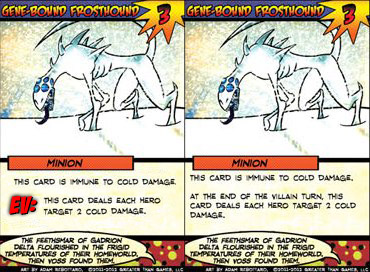
Raise your hand if you wouldn't rather scan a table full of cards like the one on the left (see attached) than the one on the right.  Would sure make it more difficult to miss important effects.  And clutter = less, with the removal of all those words.

frosthound.jpg

PY
pyrofrog
2013-08-07 22:19 UTC
#28

Hey Spiff, you know that I love all of your accessories and you have a lot of great ideas. I think the updated card is very easy to read and makes the pertinent info very easy to read at a glance... 

But I do believe that icons, while making the card text more concise, can be a turn off for some gamers. (Especially some of the more casual gamers.) and I see the overall intent to make the game accessible to everybody.  

Over the weekend, I don't even know how many people we taught the game to at the convention. In a Very Loud and Chaotic Room. And I never heard a complaint about them being hard to read or understand. This can be an inconvenience, but does it ruin the game? Is it worth breaking the continuity and flow of the cards?

I also can't say I'm a fan of mixed logos and such. Luckily I came during the EE kickstarter, so I didn't have to worry about some cards having the "H" and others not, but we would be promoting having fewer cards with a new layout than the majority. I think it's better for a future EE ver 2.0 printing or not to do it. 


SP
Spiff
2013-08-07 22:25 UTC
#29

I don't understand that at all.  In one sentence you say it's easy to read and makes the pertinent info easy to read at a glance, but for some reason those things will turn off a casual gamer?  Those sound like exactly the things a casual gamer would want, and it's only the people who have memorized every card who wouldn't (?).

CA
Casualace
2013-08-07 22:30 UTC
#30

Hey guys, I don’t chime in much because well,even though I myself am a paid playtester, I playtest with Reckless. And he posts enough for two people. Anyway I felt like I would chime in on this. For one adding start of turn and end of turn symbols would require greater than games to reprint all the sets. I feel that this would be a waste of time and money everyone. I feel that if anything. The thing they need to be sure to do from here on out is to list start of turn effects. Then end of turn effects. And that is my yearly chime in. See you all next year!

SP
Spiff
2013-08-07 22:36 UTC
#31

It wouldn't require them to reprint all the sets anymore than printing the EE required them to reprint anything but the EE.  Some cards would have icons, some wouldn't.

JA
jagarciao
2013-08-07 22:39 UTC
#32

I think too many icons can be intimidating to new and casual gamers (it is the #1 complaint for Race of the Galaxy), but I don't think a big stylized green S or red E would really detract much or be very confusing, those are symbols we know and won't seem so foreign.  Not like those crazy icons in The Ennead...

Again though, against the argument people have for mismatched cards in future expansions I can offer no defense other than it wouldn't bother me, which isn't any better than people saying things don't bother them as they are now. 

So I guess I'll just have to keep those sharpies handy

PY
pyrofrog
2013-08-07 22:40 UTC
#33

You're absolutely right. I do think its easy to read and all of the other positive things I mentioned earlier, but I am not one who is turned off by this. As a long time magic player, I'm used to keywords and memorizing things and learning what something means.

For people like my parents, who enjoyed the game when I showed it to them, they were happy with reading actual words and honestly, didn't care much for having the "H" in the middle of text. I had to remind them what it meant a few times. 

Hopefully, this explains my previous post a little better.

BR
brytehfryguy
2013-08-07 23:07 UTC
#34

You might have to remind people a couple times, but I find it unlikely anyone wouldn't be able to rememeber the symbols when almost every card that sits in play in the game will be using one of 3. You will learn them quickly. Unlike Race which has dozens of symbols and a cheat sheet for their cheat sheet. 

SI
Silverleaf
2013-08-07 23:33 UTC
#35

Ah yes, but you guys know the game very well. You probably have all the cards memorised to some extent, and if you were playing with new people I'm betting that you were the one that dealt with the villain and environment decks. People tend to be okay at keeping track of their own deck, especially as hero cards that have SoT and EoT effects seem to be rarer than one-shots and "constant effect" ongoings.

In my group, it tends to be me that does the villain and often the environment too. I'm a "normal" player in that I've played a fair bit, have a decent handle on the rules, know vaguely what a lot of the cards do but not the specifics, and still have to check everything every time. My players are all less experienced with the game than me but have played a bit. And as a group we're constantly missing things and having to backtrack, or forgetting, especially with text on villain character cards. I don't think we're atypical in that respect.

One of my friends has also commented on several occasions that he doesn't know how anyone can play without Start and End tokens…

SI
Silverleaf
2013-08-07 23:41 UTC
#36

I see where you're going, but i don't believe that Start and End icons would interrupt the text in the same way as the H icon. And for me at least, it isn't the reading itself that's the problem - I'm perfectly happy to read all the text when a card comes out. But I don't want to have to reread it all twice a turn just to make sure I haven't missed something that should be happening now. I want to be, you know, playing the game.

PY
pyrofrog
2013-08-08 00:32 UTC
#37

Actually, I have some of the hero cards I use down pretty well, but I have to check every villain and environment, and some heroes every time.

You're right, I did run the villain and environment in a number of games, but we just used the tokens to keep track and it went well.

[quote="Silverleaf"]
One of my friends has also commented on several occasions that he doesn't know how anyone can play without Start and End tokens...
[/quote]
Completely agree with this, and the oversize villains as well.
PY
pyrofrog
2013-08-08 00:48 UTC
#38

In the end... Do I think formatting differently would effect my gameplay? No. I don't feel that streamlining it will change my games much. I did agree to some positive effects it would have earlier in the conversation.

I think my case really is that I, personally, would rather finish things out with a uniform look to the cards. If there is a demand for it later, make the change throughout the entire game.  I don't see myself re-purchasing everything later on so that I can have a streamlined system.  At some point, they're going to want to reprint/redesign the cards that we know have errors/errata so that the game itself needs fewer explanations.  THAT is the version that should have logos/reformatting. 

Just my opinion. Thanks for reading. :)

AR
arenson9
2013-08-08 03:43 UTC
#39

I think start, end, and some sort of other-trigger icon would have been a good idea: Easy to learn quickly, much easier to grok each card, and saves space on cards. I think the argument against, that one should be able to play w/out having to look up info in a manual is a false dichotomy. It's not all or nothing. The game should make it so that there isn't too much to look up. That's a subjective measure, I admit.


If these were added to now, either just to new expansions or to reprints, it would cause some confusion and maybe even resentment from those of us who have already invested in the game. The confusion doesn't seem like it would be a big problem to me, and I think most people would not be too upset by having a previous edition.


The real obstacle I see is time from the designers. They have too many other higher priority tasks.


As a follow up, why do we need EV, instead of just an E icon? The times when a card triggers on something besides its own deck, I don't think specifying hero vs villain vs environment will help much.

FO
Foote
2013-08-08 03:54 UTC
#40

There will be plenty of time for icons when GSF comes out. 

SI
Silverleaf
2013-08-08 04:18 UTC
#41

I can see it being useful to make it clear when things act "out of turn" like the Treacherous Ape. It'd be helpful to have some kind of icon to cue that it happens at the start of the hero turn rather than the villain, and it would be good if it used the same icon that we were already used to seeing as "start of hero turn" rather than "start of any turn". Start of villain, start of hero and start of environment are three completely different things, and I don't see how lumping them all together with just one icon would make things clearer.

Also many environment cards reference hero turns in some way. I wouldn't use a start/end token for that so I never know what to do to mark it for myself.

SI
Silverleaf
2013-08-08 04:19 UTC
#42

Yeah. Except some of us have no interest in GSF. Heresy, I know!

BL
BlueHairedMeerkat
2013-08-08 11:22 UTC
#43

One thing that's been brought up a couple of times but not really been discussed is the third icon, the 'whenever' one. While I don't really have an opinion on the start/end of turn icons, I really don't think 'whenever' is a good idea at all. For a start, it's replacing a lot less text - the word 'when' or 'whenever' instead of seven, and in fact you probably wouldn't even be able to remove the word without the sentence not making sense any more - meaning it will take up more space instead of less. Not a big deal, but still not ideal.

Further, I don't see how it would make the game any simpler. The start/end of turn icons have a clear 'when' about them; it's the start of the villain turn, so you scan her cards for SV icons. Whenever icons, on the other hand, can activate pretty much at any point, so you end up in the exact same situation we have now, except this time there are W icons all over the cards. There may be a minor benefit in having the icons as a reminder to check the card to see what the effect is and when it activates, but that's such a minor benefit that it's rather outweighed by the issues of inconsistency and over-iconning.

PQ
PePe_QuiCoSE
2013-08-08 13:58 UTC
#44

I don't really care if it's an icon or not, I do know it's the one I miss the most. Since I'm busy resolving something else and if I didn't take it into consideration before starting to resolve X action I would miss it. Start of turn and End of turn are easier if you are running the phases meticulously, the 'whenever' you can always miss it. So whatever is good to make them easier to remember is good for me. Right now I put them in the center of the table and still I miss them time to time, specially the Environment ones.


Also didn't had a problem showing the game to new players but it was because they only had to read their cards in hand, they didn't even need to read other players cards since each would tell what each one card did. Same for Villain and Environment, since I was telling them what they did and knew the cards pretty much back to back (Blade+Mars). More-so since we are native spanish speakers so we 'translate' the cards on the fly, just say what they do. Now had each of the guys had to read each card in play and themselves follow the instructions of everything, their experience would the game would have been quite different. Now big, few, icons for things here and there would make a world of difference (since they are basically language-independent) and they would have been able to point out stuff to be played even without needing to read the cards, just say "hey, didn't we miss that big red (E) there?".

As I said earlier, all the arguments of what's best for GTG guys it's up to them. That's not what's being discussed here IMO (at least I don't have such big feeling of entitlement) and doesn't change a bit if icons make the game easier to play or not.

On the argument of "let's keep consistency, so keep text no icons" I'll counter: how much more text are you capable of digesting? Owning all released stuff, excluding promos, I have playd through everything in the past weeks. Each new Villain/Environment I played took up a lot of extra attention from me to learn what they did, their triggers and on what to focus. Such effort always made the first play less exciting than the second one. And when going back to the core guys after playing several other Villain made me have to 're-learn' them. Now I'm the kind of hardcore-obsessive gamer that when it picks a game, it fully dives into it so I got through that effort. But do you really expect the less attached gamer would put the same time into it? Wouldn't it be just more probable it'll say the game just has too much bookeeping and move on to a different game? I know most of my gaming buddies would. I'm not sure I'm making my point accross, but basically it's the more expansions you release, the heavier the burden it becomes to memorize all the cards and be able to identify cards with just a glance. The more you need an 'alpha' player at the table to guide the players through the Villain/Environment. The easier it is to get the information of all the cards in play, the more information you can handle without breaking the game's flow.

On which icons I think are worth, I think a big (S) for start and (E) for end are a must. (V), (E) for Villain and environment, I'm indifferent. Some kind of highlighting, or italics, underline, caps, whetever for the "WHENEVER" cards is also a must.


AR
arenson9
2013-08-08 16:19 UTC
#45

Agreed -- the discussion of what would make the game better is different than the discussion of what is a good/practical choice for Greater Than Games.


Re: A 'Whenever' icon. I agree that adding a token would not replace text, but actually end up using more card space. That's clearly a detriment, but I think it would be outweighed by the value of being able to tell at a glance that there are out-of-turn effects to be considered. As an aside, I think that out-of-turn effects cause the most work in the game by far. They are the reason that for a long time I was very unenthusiastic about playing Spite.


By the way, perhaps 'Whenever' is the wrong term and 'Out-of-turn' is more appropriate, such that we'd want an 'O' icon, rather than a 'W' icon.


It's possible, though, that what would be even better would be to identify a (hopefully!) small number of conditions and use different icons for each. Perhaps they would be things like 'Upon being attacked', 'Upon using a power', 'Upon playing a card', 'Upon drawing a card'. The big problem I see with this, though, is that the number of icons one must understand quickly grows to be more of an effort that just reading and understanding the cards.


Any game is easier to play, I think, when someone who knows it teaches it, rather than having to learn the game oneself. Sentinels is deceptively complex, because all of the complexity of the game is written into the cards rather than the base rules. Because of this, if I teach the game to some folks and they excitedly go off to play on their own and then run into the difficulty of having to figure out lots of details (Spite, Ennead as prime examples), I could see them being turned off. My impression, however, has been that enough people get excited enough about Sentinels that they're happy to put in the effort to understand that complexity.

SP
Spiff
2013-08-08 17:01 UTC
#46

Re: the "whenever" icon, my 3D token set has an arrow curling back on itself, used to show when something on the card happens in response to something else, which I agree would be useful.  In this case, it wouldn't be replacing text, it would be serving the other purpose of an icon, to quickly call your attention to something.  I think something like that would be very helpful, though I agree it's less vital than the start- and end- icons would be.

Think about it - the only reason we need tokens at all is to help us remember what's hard to remember or hard to notice on the cards in the first place.  The fact that the official tokens even exist is evidence that some sort of improvement along the lines we're discussing would be useful to the game.

RO
Ronway
2013-08-08 17:15 UTC
#47

I might as well chime in. First of all, Icons improving the game is a matter of opinion, and not a fact.

The reason I am against adding "start" and "end" of turn icons, is there is a lot of different cards that trigger on different start and end of turns. Such as Divine Focus is the start of every turn, Treachous Ape only triggers on the start of the heroes turn, Time Flies triggers at the start of every villain turn, and of course cards that trigger at the start of their own respective turns. So that's 6 icons already for start of turns, thus making another 6 for end of. So that's 12 icons to remember already.

Now I also don't like the idea of some cards having icons for their trigger, so there would need to be icons for other triggers. The "Out-Of-Turn" or "Whenever" doesn't sound very fitting, as you'll still have different triggers, if icons are there to make it so you don't have to read a phrase than those would still make you have to read to make sure you are on the right trigger. Meaning there would have to be an icon for each other trigger, such as; a hero card is played, a hero card enters play, a villain card enters play, a environment card enter plays, and any card enters play. There are also more specific ones, such as Matriach's Fowls. That is just cards entering play, you still have various drawing effects, powers, damage dealt, damage taken, and many more. That is looking up to about 30+ icons that would have to be remembered. Sounds like there'll have to keep a rule book near by to be able to look up any icon if needed.

An icon for just 12 triggers sounds messy when there is a whole list of other triggers that occur in the game. I personally would rather look at every card for those triggers and be able to read it, rather than looking at the cards, forgetting what one means, having to go to the rule book to find it to know if I even triggered anything.

JA
jagarciao
2013-08-08 17:23 UTC
#48

I played with the idea of marking the cards further to highlight other out of turn triggers, but there just so many that making an intuitive system that isn't too complicated does become difficult:

Whenever a card is played. 

Whenever a power is used. 

Whenever a target is destroyed. 

Whenever damage is dealt. 

Whenever damage is taken. 

Whenever something enters play. 

There's also soapy different ones that just marking them all as out-of-turn activities doesn't splify things much. So I am still trying to figure out what the best system would be to bring attention to these actions. 

FO
Foote
2013-08-08 18:20 UTC
#49

Literacy?

There are so many different ones I am not sure there is a simple, clear cut solution. There are absolutley "different" approaches. But they all have their pros and cons. And I am very much in Ronways corner on this. It is not as simple as just adding 3-4 icons for triggers. Reading may not be fun for some, but know what is not fun for me? Having to thumb through a rulebook of 20+ icons trying to remember which ones do what. That sounds craptastic.

Trigger Icons or not, you still have to read the cards right? 

PQ
PePe_QuiCoSE
2013-08-08 18:41 UTC
#50

Of course it is not a fact, we are not talking science here. But it's the same way it's not a fact that the (H) icon improved the game, or that it should have been text instead of an icon, or that art helps recreate the theme. It's a matter of perceived value: balance in games is something highly appreciated by a lot of people but it's not a fact that it makes games better since in the end it's a matter of preference. What it is a fact (well, usually) is that regardless of your starting position in a game, your chances or winning are more dependant on your skill than on external game factors on balanced game than not. I'm going working as a base ground that it is all around better to spend the least amount of time working out how things should be resolved and resolving them (that is, getting to the fun) than otherwise. The popularity of different iOS implementations of boardgames seem to imply that a lot of people share that view. Particularly the ones that helps you play the game rather than playing it, pretty sure I can think of one…

Back to the icon thing: it's the same way, it is a fact that imagery makes recognition faster than text (once you are familiar with the imagery, of course). Those who have memorized cards when playing (I do some) how do you do to know what a card does? You look at the picture (not the title), quickly identify it and resolve what it does without looking at the text. When the image is not enough, you scan the text to find the words that you know will help you find the text you are interested in (IMO, Start, End, Whenever).


So I just need to ask now, is there really people here that prefer to spend time reading the same card each turn to find out if you needed to read it in the first place, rather than have it memorized, just glimpse at the picture, and know what to do?

RE
Reckless
2013-08-08 18:49 UTC
#51

I think Ronway is saying that attitudes like this seem to imply that your perspective is the "fun" perspective and everyone else is the "boring, reading perspective".  You are bothered by the SoT/EoT text.  Others aren't.  Asking this question will not change that.

Again, I'm indifferent about including symbols, but there are clearly people who prefer the SoT/EoT text to remain the same.  So, yes, apparently there are some people who prefer it the way it is.  By asking this question over and over again, you're disregarding their opinion and implying that it is a "bad" one.  Please stop doing that, and focus on your concerns without insulting others who hold a different viewpoint than you.

AR
arenson9
2013-08-08 19:09 UTC
#52

Yeah, I wouldn't like having 20 icons. About 3 or 4 would be my limit.


Indeed, there are lots and lots of variations to the out-of-turn triggers. I think, though, that seeing something like Spiff's arrow curling back on itself would at least allow me, at a glance, to see which cards have text that I need to account for. 


Btw, considering that some 'Out-of-turn' triggers actually happen on their own turn (Fowl causing another card to be played, for instance), I'm retreating from the idea that 'Out-of-turn' is a good catch-all. Maybe just 'Trigger'.


It will be interesting to see how the Handelabra folks handle displaying information for iOS and Android. Will they attempt to graphically show what triggers are out there? In advance of something happening, or after the fact (or both)? This is a bigger question than just Start/End/Triggers, as the apps will presumably need to show why 3 fire damage was done rather than the 1 sonic damage a hero attempted.

PQ
PePe_QuiCoSE
2013-08-08 19:25 UTC
#53

You see, this forum is a lot more literal than others, so I was trying to go step by step. Not good and now I'm insulting people. My question there was NOT about icons, was about memorizing cards. I'm not bothered by text, wouldn't have gotten into the game in the first place if that was the case. But that doesn't mean I don't think things can be improved.

IIRC, nobody here has said that they prefer to read the cards every turn over just glimpsing at the board, even you said you don't find it tortuous since you have them memorized. They said Icons are not a good solution (too complex, too many), could turn off casual gamers, that backwards compatibility is a thing that could impact sales/rebuys. All reasonable things which I think some of them contribute to the dicussion (Icons not good enough) and others don't since they exceed the scope of what can be discusses by fans. I was trying to establish a ground rule as to work a consensus from there. If someone said "I think the game is more fun when I read every environment card each time I deal damage to check if it has any impact" then I would know that I'm way off and should drop my point. So far that hasn't been the case. This is important (to me at least) because if Icons are really not a practical solution, there might be other ways to help this issue (which started only as START of turn and END of turn and extended to everything). For example, there are games that label keywords in colors so make it easier to relate to icons/rules. IIRC Order of the Stick has Red for Attack, Blue for Defense where text applies and the cards that have the values of the damage/defense had the same color. Alien Frontiers have icons to represent the resources in the game. I'm pretty sure there are tons of games to take as example of how can this be helped, making identifying cards function faster, if that's something people care about.

Also it doesn't help that some of us arguing in favour of Icons are vouching for different ones. I'm only 100% on START and END. I know that WHENEVER is the most annoying one for me, but would need to check the cards to see if there's a discernible pattern for recognition. If the issue is not Icons per se, but the proper amount of Icons, then we can further the discussion.


So, my time to apologize to those who have felt insulted by my position and attitude, I was just being blunt to get a straight answer rather than going in circles with the arguments.

SI
Silverleaf
2013-08-08 19:36 UTC
#54

I'm not asking for a million different icons. Here's what I want:

  • Start of Villain
  • Start of Hero
  • Start of Environment
  • End of Villain
  • End of Hero
  • End of Environment
  • Some other time (out of turn, if you like)*

I don't think 7 icons is too much, especially if they're intuitive. S means start. E means end. V/H/E means villain/hero/environment. O means other. That's like 6 letters to remember!

And with the greatest of respect to you memorisers, you're not the target audience for changes like this. You don't need them. You already have a good proportion of the cards down (if not all of them) and it's easy for you guys. It's not easy for those of us who are reading the cards every time, and just want some markers so we don't miss/forget the stuff that's already in your head, to simplify and streamline our game experience so it's a bit more like the one you enjoy right now.


* I know, this icon won't help you remember that a particular card triggers when a target is destroyed, or when you play a card or whenever, or whatever. But it will remind you that something out-of-the-ordinary happens with that card and lead your eye to the appropriate bit of text right away. It'll be a visual indicator of "Oh, something weird happens with this card, I need to be aware of that." I don't believe there's any need to create individual icons for every single case because as a few people have said, there are too many of them and possibly some would only be needed on a couple of cards. It's enough to have SV, SH, SE, EV, EH, EE (these 6 happen very frequently) and I guess O covers everything else fine.

SP
Spiff
2013-08-08 20:35 UTC
#55

spend time reading the same card each turn to find out if you needed to read it in the first place

That's it exactly.  Too much time doing that.  I want [an icon|some easy way] to tell me if I need to read it as I scan across the table.  Right now we're using tokens to do exactly this.  An on-card indicator would do the trick more elegantly.

JA
jagarciao
2013-08-08 20:57 UTC
#56

Not sure what literacy has to do with bringing attention to the cards.  Of course you have to read the cards to figure out what they do. The idea here is that when there are  20+ cards on the table that havent been memorized, it would be great if it wasn't necessary to read all 20 cards every time you perform any action to make sure you are not missing a triggered effect. 

The post you are quoting in your comment is one in which I was pointing out the difficulty of this since I myself couldn't even come with a system to which to mark my own cards to mark my own cards in an efficient and effective way… so I could see how capturing that in a manner that was easy for all players would be a tall order for the game designers. 

TS
Theta_Sigma
2013-08-08 22:44 UTC
#57

Trying to hit something of a middle ground here, but what about bolding key words?


"At the start of the villain turn..."

PH
phantaskippy
2013-08-09 02:55 UTC
#58

Easy to pull off if you use color, again there are color blind people out there, so what colors is an issue.

one for start, one for end, then letters for the turn.  Sadly the most intuitive colors are green and red.

That would be the best way to do icons though, a green V means start of villain, a red E means start of environment.

You would still need the text, the icon would need to be somewhere on the card, but not replacing the text.  The icon would be there to let you know to read the text.


I'm not in support of this, simply because it would not be universal, it would only be new cards, and there are tons of cards without them.  I'm just pointing out that icons can be done well.  

SE
Sefirit
2013-08-09 19:24 UTC
#59

What if instead of icons they just used bolded words followed by colons like 

Start:  Or bolded and all caps like  END: rather than the full phrase of "At the start of the turn"

Maybe you need more clarification as to what turn is starting but you could do things like

START VILLIAN:,  or END HERO:

Then people wouldn't have to look up icons.

Z2
z2xm
2013-08-11 05:03 UTC
#60

Here is a great example for needing a change.  Last night we were facing La Capitan, and things were not going great.  She had several crew out there.  So at the beginning of the turn we have to read the full text of 5+ cards, because the order between start of villan turn, and end of villan turn effects varies between cards ("Chip" is a good example of an end of turn listed before a start of turn effect).  Then at the end of her turn we get to re-read all of the text we just read.  Over and over, game after game because there is no consistancy, nor symbology.


Contrast that with a game that uses a ton of iconography, Race for the Galaxy.  The cards are filled with symbols.  For the first 2 or 3 games, there were a lot of references to the helper cards.  Now our group can pick that game up after not playing for 7-10 months and we remeber what they mean.  Yet we have played SotM every week for the last 2.5 months and we have to read the full text of each card every turn.  It is easily adding 30% tot he length of each game.  It is the one thing that garners the most grumbling in our group, it is actually one of the only things the whole group has ever agreed on disliking, usually people are on both sides, but this had us in agreement. 


It's not that it is a massive, catastrophic issue, but it is a large negative that nags at us every turn, of every game, of every session in which we play, and that shouldn't be ignored.

AR
arenson9
2013-08-11 05:17 UTC
#61


Do you use the Start and End tokens from the extra tokens pack? 

RA
Rabit
2013-08-11 13:34 UTC
#62

I think this is going to be an issue of personal preference. The >G folks have done their analysis and come to a conclusion that it sounds like some folks are asking them to revisit. It has definitely been an interesting conversation. Personally, I really appreciate that you've all been so civil about it! :slightly_smiling_face:

My thoughts are long and elaborate, and I haven't been able to make time to type them out. (Honestly, I shouldn't be doing it now, but I felt like it wasn't going to happen anytime soon, anyway so I might as well make it happen. :confused: )

When dealing with any kind of user interface (which is what we're talking about), the design has three audiences to consider: Novice, Experienced, and Expert. In this context, those of us who are used to gaming iconography are going to be experienced by default. In general, icons alienate novices, as they just don't know what they're supposed to do with it. (I often have this issue at work, where I need to ensure everyone understands what's being shown on a screen / document / presentation, but everyone has a different current level of understanding and experience.)

I shared Spiff's image of the side-by-side Frosthounds with a person who is an intelligent, casual gamer who has been playing Sentinels as long as (although admittedly not as much as) I have - since it was first released. I just told the person to take a look at the versions and let me know what they thought. The person glanced at the cards and immediately said "What's 'EV' mean?". I told them to read both cards, completely. They did, and said, "Okay, but what's 'EV' mean." I pointed to the "At the start of the villain turn" clause then at the "EV". Naturally, the person immediate understood the meaning, but without that side-by-side comparison it would require going through the rulebook and finding the information for them to get that, and that doesn't mean the person would immediately have gotten it nor that the person would have found the game as enjoyable if they were playing it that way for the first time.

My personal experience is that a lot of people just don't/can't think in symbols. There's nothing wrong with that, it's just an obstacle that we create when we require them to do so.

Personally, on my made-up villain and environment, I've colored all the triggers (not just the key words, as that doesn't tend to stand out enough for us). Note: We don't have anyone in our play group who is color blind. This has really helped accellerate gameplay with these decks. I haven't bolded the phrases, yet, but I think I'm going to do that next. My only concern is that it might take up more room, and for some cards that might be an issue.

In general, I think something like this is far easier to manage and deal with. It helps the novices, in that they have nothing to reference, and it helps the experienced as they have something to glance at to find what they need.

The Start and End tokens make a huge difference, since so many of the triggers are based on these. It's the "oddities", the triggers like when a card is played, that are harder to remember. It's not like we're going to do something to review all the cards for triggers every time we do something. Personally, I have a bag of various kinds of tokens and dice that I use for this - if there's something that triggers on card draw, I put a bright and shiny token on my deck. If there's something that triggers on damage, I put a different one in my HP pile. Things like that that will remind me that something happens. Because these are so rare, it's easy enough to manage that way as there is likely few such triggers in play.


(Notice I never talk about experts. That's because they have all the cards memorized and don't need to read them anymore… :wink: )

SP
Spiff
2013-08-11 15:59 UTC
#63

The >G folks have done their analysis and come to a conclusion that it sounds like some folks are asking them to revisit.

I think it would be great if they ran actual user interface  experiments, like we do in software.  Mock up some cards both with and without simple icons and do two things:  (1) ask people which one they think would make the game easier to play, and then (2) watch them play with both to see which actually do make the game easier to play.  The results from (1) will be interesting, but the results from (2) will be the actual meat of what you want to know.

Novice, Experienced, and Expert.

I agree.  I think the Expert users should be consulted for their opinions, but not necessarily studied with UI experiments since, by definition, they're Experts, so they will likely be able to play the game smoothly regardless of whether text or icons are used.  But you should test how novices play and how experienced players play.  I can't imagine that icons will slow down or make either group of players have a diminished experience with the game, but without data, that's just an opinion.

I shared Spiff's image of the side-by-side Frosthounds with a person who is an intelligent, casual gamer who has been playing Sentinels as long as (although admittedly not as much as) I have - since it was first released. I just told the person to take a look at the versions and let me know what they thought. The person glanced at the cards and immediately said "What's 'EV' mean?".

Was your experiment with your friend to see if he could figure out what the icon meant without ever having read about it in a rule book once?  The first time you showed him the "H" symbol, could he immediately figure out what that one meant with no clues?  The best symbol is one that you can figure out without being told what it means, but the goal with these icons is to reduce the amount of reading and re-reading players need to do on a table full of cards.  You should only need to tell a player what the icon represents once for that goal to be met, I think.

SP
Spiff
2013-08-11 17:03 UTC
#64

In fact, it occurs to me that we have the perfect opportunity to gather data on how the use of icons would affect the game right now with the Vengeance playtesting.  You guys are all using home-printed decks, they're getting played heavily, and you probably haven't memorized every word on every one of the cards yet.  If we can get Christopher to agree to it, someone can send me a couple of playtester decks (I know that sounds self-serving...) and I will modify them to use icons like we've been discussing.  Then you guys can print them out and use them for your playtesting.  If after a few weeks of play, the consensus of the playtesters (admittedly not a great usability group since I think you guys mostly are Expert users) say that the icons slow you down (somehow), then we'll have that data.  If (as I expect) the consensus is that it's actually kind of nice to be able to scan the table and see immediately which cards you need to pay attention to at any given time, then we'll have that data.

The time is now.

PA
Paul
2013-08-11 17:25 UTC
#65

I love this discussion, as I think that it really helps explore the various facets to the "icons vs no icons" discussion. This and similar discussions are definitely things that we read and take into account for future game design.

However, I feel that I should make clear that, at this point, Greater Than Games has determined that it is not currently the best use of our limited time or money to re-engineer the Sentinels of the Multiverse card game with the kinds of iconography that some people are advocating. As usual, we reserve the right to change our minds and opinions at some point in the future. However, for the time being, I consider this discussion to be purely philisophical.

SP
Spiff
2013-08-11 17:30 UTC
#66

However, for the time being, I consider this discussion to be purely philisophical.

Does that mean you don't want to gather data for a future decision, too?

FO
Foote
2013-08-11 17:37 UTC
#67

Spiff, for what it's worth, I think they have been. The way GSF utilizes icons for its effect triggers is very simple and intuitive without a massive number of them to remember. Even though SotM won't be retrofitted (and rightfully so) with those changes, you can see the effects of our discussions on it in their current designs. 

RA
Rabit
2013-08-11 17:41 UTC
#68

No offense, Spiff, but playtesting is self-selecting experienced players - there are no novice players in the playtesting community. Yes, we're new to the cards, but we're experienced with gaming and/or SotM, so it removes the factor of new players. And I think that's where the concern with icons resides - at least, that's it for me.

Mind you, I am definitely not saying icons slow anyone down. (Has anyone actually said that? Not sure where that came from, but I might have missed it. :confused: )

I also don't think the current situation is optimal.

Here's my thoughts, as succinctly as I can:

  • Lack of method of easy trigger identification creates a delay in game play as players must review all cards at standard trigger points (e.g., end of turn, start of turn)
  • Lack of method of easy trigger identification creates missed play moments and issues with game play as players miss non-standard trigger points (e.g., card is destroyed, card is played)
  • Icons create an additional learning point in the game (with a short learning curve)
  • Icons reduce novice gamers interest in the game
 

I don't believe icons slow down the game, but they have other detriments that make them less favorable, in my opinion.

In playtesting, I've highlighted text as others have described. This resolved the situation for us - at start of turn, I glance at the board and can easily see all the green highlights. At end of turn, I glance at the board and can easily see all the red (okay, pink :wink: ) highlights. Now, we can't just highlight (colorblind players won't benefit from that) but it's definitely a start towards something easier and quicker.

My opinion is we should look at ways to make the current text more readily visible at a glance. This allows new players to see and read the full text without creating another learning point while still allowing players to glance at the cards and understand what is potentially triggered. It's not optimal, as the non-standard trigger points are still a potential issue, but just having them more visible will help keep them in players' minds.

Are there other options that might promote recognition of triggers?

RA
Rabit
2013-08-11 17:44 UTC
#69

(I take too long to post… :confused: )

I also think GSF targets experienced gamers moreso than SotM, and I think the iconography used in it is great for that audience. Where I think SotM will pull in people who wouldn't normally game, I don't think we'll see GSF doing that - not just because of the icons, but because of the type of game it is.

Just my perception, though - we'll see how things play out! :slightly_smiling_face:

PA
Paul
2013-08-11 18:43 UTC
#70

@Spiff

You can definitely feel free to gather and share any data you wish, and we'll definitely take a look! However, I just want everyone involved in this discussion to be aware that the formatting / templating of the SotM card game is not going to change for the forseeable future.

SP
Spiff
2013-08-11 18:47 UTC
#71

Icons reduce novice gamers interest in the game

This has been repeated a couple of times as if it's fact, but it's unsubtantiated as far as I know.  Excessive use of overly complicated icons almost certainly would.  There's no evidence that limited use of simple icons would.

SI
Silverleaf
2013-08-11 18:50 UTC
#72

You see, we have a trade-off here. One one hand, icons or similar will make things less accessible to brand new players*, especially the ones who haven't read the rules**, and will require more effort when learning the game. And on the other, icons will make things easier/quicker/more accurate for new and experienced players (but probably won't make much difference to expert ones) for the whole of the rest of their Sentinels gaming experience.

Somewhat off-topic, but bear with me. I sing in a choir (actually I sing in 4, but I'm thinking of one in particular) where we work exclusively from sheet music and are expected to be able to accurately sing pieces we've never seen before, requiring us to have previously learned to read standard music notation (which does take some effort to learn). One of our members cannot, which makes things extremely difficult for him. It's only because he has the support of fellow section members who read well and because he has a good ear and a great slug of natural talent and can "anticipate" what will happen next that he manages to cope at all. The moral? Sometimes it's better to break through the barrier of some initial learning to make your experience easier or better later on.


* I think we'd be underestimating the intelligence of new players to assume that they can't handle a few symbols easily. Put them on the back of the rule book in the appropriate place in the turn order sequence. I doubt very much that anyone would have to look them up after the intial learning-how-the-game-works stage (which maybe takes 10 minutes). We're not talking 7 Wonders here (a very easy game that's intially very hard to play because of the number of different icons).

** It's unreasonable to expect to be able to play a game like this without reading the rules or having someone who knows them already explain them. Therefore I'm inclined to discount such people.

SI
Silverleaf
2013-08-11 19:15 UTC
#73

Not evidence here, but personal opinion - icons would chop the wall of text that is on some cards (by necessity at the moment) into smaller chunks with more white space to visually separate them. Kind of like bullet points, which are well known for making information easier to read and learn.

I'd be very happy to use my (mostly very much novice) players as guinea pigs for testing purposes, if there's some way we can do this without playtesting material. And I'm probably useful too, fitting into the experienced camp.

MA
Matchstickman
2013-08-11 19:55 UTC
#74

You know who we should really be getting in on this discussion, the people writing the iOS/Android game, that is the perfect time to try out new icons

SP
Spiff
2013-08-11 21:30 UTC
#75

You can definitely feel free to gather and share any data you wish, and we'll definitely take a look!

Challenge accepted.  First step is to have some iconified cards for people to test out.  In one afternoon of Photoshopping, here's what I came up with as an iconified Grand Warlord Voss deck (Voss having almost nothing but cards with start- or end-of-turn effects).  I've replicated the entire deck so that people can just print it out and play with it to see how the icons affect their experience.

The cards look just like the official printed cards except I didn't bother to put the flavor text on there (sue me), but it does have the art.  I didn't want them to be stripped-down art-less cards, because that would affect the experiment.  If you ended up hating playing with these cards, was it because of the icons, or because they were hoopty art-less versions?  Hopefully that won't be an issue.

Replicating full decks feels dangerously close to copyright infringement, but I rationalize it by pointing out that you can't play the game with just a Voss deck alone, so hopefully it's not so bad.  If anyone official wants me to remove the file, of course I will.

The cards have the "SV:" and "EV:" symbols to indicate when an effect happens at the start or end of the villain phase.  Players should assume that they were made aware of the meaning of these symbols when they read the instruction manual for the game and not try to puzzle out the mystery of what an "S" next to a "V" could possibly mean in the game. ;)

I'm particularly please with how the TCF spaceships and the villain card looks.  They have both start- and end-of-turn effects on the card, and the SV and EV icons clean their cards up so much.  Very easy to see what you need to do on those cards now.

I went a little further and added a green shield icon to cards which have a damage reduction effect, and a red explosion icon to cards which give a damage boost.  I'm not as certain about the benefits of these icons, but since these are common effects which you need to be able to remember every time you deal or receive damage, I figured I'd toss them on there to see how it went.  There could be any number of icons to represent things you should remember in the game, but I didn't want to go too crazy.  If people decide that even these two are too much, they're easily removable.

(I'd love to be able to do something about the wordiness of "the hero target with the highest hp" too, but we're taking baby steps here.)

Please don't get hung up on the fact that I used red and green colors for the icons.  These aren't any kind of a finished product, and I know they're troublesome for some colorblind people.  If it turned out that everyone loved the icons so much that >G reprinted every single deck with icons tomorrow, I'd assume that they'd choose a more appropriate color.  For my slapped-together Voss cards, I went with the obvious red and green.

So, print them out (hopefully in color, but if not, maybe you can highlight the icons to add the effect a color version would have), play with them a couple of times, and let's hear of your experiences.

SI
Silverleaf
2013-08-11 23:42 UTC
#76

Brilliant! They look fantastic, great job.

I've never actually fought Voss in a face-to-face actually-using-the-cards kind of way (although I've played against him in quite a few online games with Ronway dealing with all the SoT/EoT stuff). So that's perfect, I can go in with pretty much no knowledge of the card text and do a few tests with these and the official deck. Might even get some of my players to run the villain deck instead of me and see how that goes.

I know I've mentioned it before, but there's no need to avoid red and green if you make sure that it's not the only way to distinguish between the two objects - a different background pattern, outline colour, size, letters in this case, or font can make even a red and green with similar values easily distinguishable by people with red-green colourblindness. Of course, sufficient contrast between the colours would be best. I've made my own copy of Qwirkle (notoriously bad for two of the common types of colourblindness) because my friend is mildly affected and wouldn't be able to distinguish some of the colours. I used red, orange, yellow, green, blue and a sort of mauve purple, and every hue was carefully selected to be accessible to any type of colourblindess (or even complete lack of colour vision - i do know someone who sees entirely in shades of grey). It's totally do-able.

SI
Silverleaf
2013-08-11 23:53 UTC
#77

Very helpful page with an appropriate colourblind-friendly palette: http://jfly.iam.u-tokyo.ac.jp/color/#pallet

RA
Rabit
2013-08-12 01:11 UTC
#78

Love the changes, Spiff! Truly things of beauty. I especially love the damage reduction and increase icons - great stuff! Thank you for putting them together.

Would you be willing to share the images (or fonts) you're using for the various icons?

Silverleaf, thank you for that link. I'll definitely be making use of that for my home-brewed cards!

SP
Spiff
2013-08-12 02:26 UTC
#79

Would you be willing to share the images (or fonts) you're using for the various icons?

Sure.  The "SV:" and "EV:" are just the CrashLanding font from Blambot overlayed with a gradient to make it look like the hp value does.  The shield and explosion are just things I snatched off the internet.  I've attached .png versions of each of those elements to this post.

icons.zip (71.5 KB)

RE
Reckless
2013-08-12 21:29 UTC
#80

Those look quite nice, if symbols were to be implemented.  I'm not terribly invested in the idea, but if it happened like this I wouldn't have a problem with it.

I believe the Shock Infantry does 3 Lightning damage rather than 2, however.

SP
Spiff
2013-08-12 21:57 UTC
#81

I'll double-check and update the file after work.  Thanks.

PU
Pushingthelimits
2013-08-13 02:02 UTC
#82

I appreciate that the >G team responded to this post. It was not the answer I wanted but it is their choice. In my opinion, they are not doing the best thing for the game by deciding to not make any changes. This game is so interesting storywise, but the mechanics of constantly checking the cards is slowing the game down without any upside.

I think the idea of bolding some specific words would be the simplest change for them to try. It introduces no new icons and there are no color blind issues.

It seems that for me, I will now get colored sharpies and start trying to underline or circle in a system that will work for me.


SP
Spiff
2013-08-14 02:02 UTC
#83

I updated the cards to fix the problem with the Gene-Bound Shock Infantry damage.